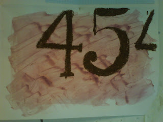
For our introduction into Graphic Design, we began our practical work by looking into the style of letting and types used on products. We produced four different compositions using different items with writing on and different backgrounds each time (collage and ink). We chose a section of the writing and used different materials each time, practicing our ability with different styles of font and writing.
I like this, mainly because I like the traditional style of font, however i do this that it is quite plain and there is a lot of excess space.
I quite like that this isn't perfect, with some bits of the block letter not filled fully and with rough lines, however i don't like the change of thickness in the letters at the bottom, which are trailing off the page. This was done using a stick and ink.
I don't like this because i think the block type looks a bit untidy and the lines aren't completely straight and i think this is obvious with it being a block colour.
This was done using my non-writing hand, my left hand, making the lines not straight and not making it as accurate as i would of liked. This was done in wax crayon.
On a whole, i like this activity as i though it was a good way to start and build confidence with different fonts and lettering and different materials that would be used within this area. I think it has given me a good first insight into what typography includes.


No comments:
Post a Comment