Saturday 29 September 2012

Work in the style of Thorsten Brinkmann...

In pairs we took pictures in the style of Thorsten Brinkmann. Brinkmann dresses people with cloaks of materials and even covers the faces. He uses pose and props to tell the attitude of the subject without using facial expression or showing any skin. Below are two examples of Brinkmanns work.


These are our own photos in the style of Brinkmann. The first image is with me as the subject and the second is how i dressed my subject.
 
(Me as the subject)


 (How i dressed my subject)


Friday 28 September 2012

Light Photos..

Our group was split into two separate groups, we then took it in turns for one group to pose while the others drew around them with torches. Because the shutter was left open on the camera it picked up any light shown over the period of time before the shutter closed. Because there was no other light in the room, it only shows the light from the torches. This gives a really nice effect and depending on the type of movement made with the torch changes the types of lines produced, for example on the image below some where draw around in a neat way where others were drawn around in a 'scribbly' way.


Thursday 27 September 2012

Photography...


We were asked to go into Chesterfield Town Centre and take pictures of 'interesting' people, whether it was them themselves that were interesting or the location. We edited the pictures and put them onto a powerpoint. These are our finished pictures.I liked this task because i though it was a good way to make us take more note of our surroundings.

Tuesday 25 September 2012

Week Three: Photography...

Annie Leibovitz
The work of Leibovitz that i looked at, was mainly her Disney dream portraits. Personally, i love them, however, i don't know whether this is because of my love for anything Disney. I like Leibovitz style, as all her work is very bright even if the colours aren't very vibrant and there is a lot of contrast, giving the photos a glow. However, on the websites that i looked at to view the work, people had argued that Leibovitz doesn't necessarily have skills as a photographer, rather more that she has a variety of skills on photoshop.


Eadweard Muybridge

I looked at Muybridges photography during my A Levels when doing a project on animals and movement. Muybridge was the first photographer to show movement within his work, he did this by documenting pictures of horses and figures moving and displaying them next to each other. Because of when these were produced, they look quite old fashioned in the sense that they arent detailed and are mainly just showing suilettes, however i think this suites the nature of the work.


Sandy Skoglund

Skoglund uses ordanary settings for her images but makes it so there is a maxium of four colours in each image (well this applies to the images i have looked at). This makes the subjects that are bright colours stand out above everything else that is present in the shot. I really like these images, because i think they suggest how everything is mass produced, even life, and i think this image below, is trying to suggest that this couples life would be dull without the cats.


Wednesday 19 September 2012

Six Illustrators that interest me..

We were asked to use the college library and find six illustrators that 'appeal to you', and i did find some interesting artists, such as Tadashi Ura and Ryo Sakuma, however, these artists didnt interest me as much as others who i had researched previously purely out of interest, so i though it would be more fitting to write about their work. 
The first four Artists used to collectively make 'The Dead Sea Mob', who did several projects together but have recently stopped this as they are each concentrating on individual work.

Dan Mumford
Mumford is, without a doubt (along side Tim Burton), my favourite artist because of his style. He works mainly with prints and uses a lot of lines within the image to show texture and detail. I think the colours and the amount of detail show is incredible. 


Drew Millward
I like the cartoon style of Millwards work and the detail added too it, much like Dan Mumfords work. I also like how vibrant the colours used are.


Tom J Newell
Newell mainly works in Black and White but does occasionally add colour. Newells most famous work to date is probably his work in Brighton and London Soho, which he did straight onto the walls on the building inside as decoration, both signed his name somewhere within and done fully in black and white. I like these because of the scale of them and let they are both still very detailed. 


TwistedLoaf
Being the last member of 'The Dead Sea Mob', TwistedLoaf follows the same style as the other three previous artists, however, he also produces work which involves very simple lines and bold colours, which is much different to the other artists work. Personally, i prefer the work which is more detailed but i like the text on the others as it is unusual and often a bit strange.


Ryan Feerer
Feerer, again, uses quite a cartoon style but uses quite nurural colours to compliment this. I like his work and his style and his often use of textology. 


Yosuke Ueno
I really like this work because i think at first glace, with the use of baby and natural colours, the work appears nice and positive but, when looked at, it actually isn't. For example, the below piece of work contains skulls and fire. The original image i found of Ueno's work i saw in a book, i couldn't find on the internet and i think this shows this technique within her work a bit better. 


Tuesday 18 September 2012

Illustration Articles.

Jaime Zollars


Looking into Illustration articles, i found one on Jamie Zollars in 3x3 Magazine (Issue 18). The article didn't contain any writing, just images of Zollars work, and so i looked more into her after looking at her images as her style really interested me. I like how the pictures has a 'sinister' aspect to them, e.g. with the example above, the unicorns, which are often seen as magical and a positive, in this are made to be aggressive and angry, challenging the usual concept people have.I also like how the Cardinals she has used in this could be symbolic towards the meaning of the piece.

"Jaime Zollars began making art at a young age, but her illustration career didn't take off until second grade, when she started drawing unicorns on friends’ Trapper Keepers for shiny nickels" (http://jaimezollars.com/portfolio/about/bio/). I like how Zollar talks about herself and her work in an unusual way and i think this is clear within her style.

Illustration...

Matthew Richardson


I really like the style of work Richardson uses. He uses collage of realistic pictures and images within these, as well as also producing work that has a cartoon style to it. The work he did V&A (right) uses very bold background colours and this is a regular thing throughout the work of his that i have looked at. I like the abstract style to his work and how each one has objects worked into them, that, at first glance, are not obvious. 
Richardson's work, 'The Meowmorphosis' (below) is my person favourite. I love how he can incorporated realistic images of cats heads onto human bodies. All the work from this collection is done purely in black and white and i think this makes it bolder and more effective in the way that it makes the fact that the images aren't 'correct' slightly more subtle.  


Sunday 16 September 2012

Week One: Graphic Design.


I liked my first insight into Graphic Design at college, although we only had a short period in the area, I felt that I gained a good initial understanding of what Graphic Design involves and what we could be doing if we chose to specialise in that area.

I mainly enjoyed looking into Typography as it really interests me and I enjoyed working with this in our assignment. I like how the subject has a large span of possibilities of what could be produced within it, e.g. Road Signs, Poster etc and the different styles and examples that we looked at.

Thursday 13 September 2012

Articles on Graphic Design..

Researching into Graphic design, i found some articles which really interested me. 
The main two articles that stood out to me were both in 'Computer Arts'(201 - June 2012). The first article was about a graphic designer form Nottingham, Lee Skinner. I found his style of work really interesting and i like how Illustration is also linked in with his work. However, the other article on the illustrator/graphic designer, Jason Dowd interested me even more. I love the style of his work and how he uses the colour in the text within his work to compliment the images. (Below - An example of Dowds work).

Wednesday 12 September 2012

The Design Museum..

Researching The Design Museum in London, i found the artist Gordon Young, who was nominated for the 'Designs of the Year Graphics Award 2012'. I really liked his style of work and the colours/design that he uses, especially the detail within the letters and i think his use of alliteration and repetition makes the type on the posters more effective and memorable.

"Gordon Young is a visual artist 
who focuses on creating art for the public domain. His work ranges from sculptures to typographic pavements for places as disrelated as government headquarters and village squares. The common denominator for all projects is the basis of relevance to the surroundings."

(Quoted from 'http://www.gordonyoung.net')

Artists Involved In Graphic Design..


Stefan Sagmeister

Sagmeister arranges things in an order to produce the image of a word, whether doing so with several possessions or a piece of material.
I really like this example of his work. Sagmeister did a piece named "Having Guts Always Works Out For Me" and this is taken from that. For each word he produced two images, the first of and object and the second of how he had placed that object to recreate the word.
I like it because it isnt simply textology,it also strongly involves the composition of the objects.


Wim Crouwel
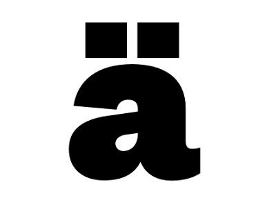
I like this example of Crouwel's work. In the below work, Crouwel has shown his 'new alphabet' which basically misses sections of the letters off, i think this shows how people are much lazier now and suggests people can't even be active enough to write letters out properly.


Alan Fletcher
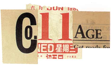
I love this example of Fletchers work. I like how he does exactly what the word means/includes. I like how he has collaged the word "collage" showing its meaning, but also used older paper, which works well with collaging often includes reusing old things (pictures, objects, text etc) to create new images.


Kris Sowersby
I like this, its simple and clear, making it very effective.


Pep Carrio
I prefer the left side of this, rather than the right. I like how the face of the subject is covered, leaving a mystery about them. The heart subjects a little about her character but doesn't reveal a lot about personality. I like how the image behind is black and white, when the over-work on the face is done in block red, making it stand out and automatically draw the viewers eyes to the face.


Noma Bar
I like how Bar uses double standard images, where the image can be one of two things, depending on how your eyes view it. This seems to be a frequent technique within Bars work and works well with the block, bold colours that are used. I think the below because of the relationship between the two images, smoking and the amount of money that the World spend/'waste' on nicotine.
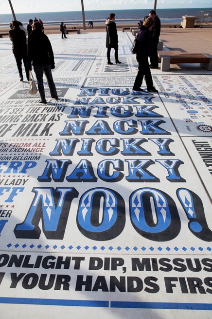


Monday 10 September 2012

What Is Graphic Design?

Advertising
Ways of selling a product to the target audience, using methods such as logos, banners (web), billboards, flyers, buses, posters, shop windows/displays etc.

Branding
     Corporate Identity - What we associate with that company, e.g. Logos - Apple, McDonalds, Tesco, Nike, Channel, Topshop, Disney etc.
     Packaging - Packaging is used to persuade and make the customer want to buy a product, whether it is because of the colouring of packaging, the text/information or simply the appearance and layout among with other reasons. Brands that use packaging to involve the consumer are such as Soap & Glory, Innocent Smoothies, Benefit etc.

Typography
Images made up purely, or mainly of text, often using different styles and fonts.

Websites
This can be done by web designers not graphic designers but when looking into the layout, image, colours etc and the general design of the website not just building a website it links to Graphic Design.

Signage
This includes signs that we use/see on a daily basis, e.g. road signs, symbols like toilet signs, entrances/exits, instructional signs etc.

Editorial Design
This is used in the design of magazines, books, journals etc and includes branding, layout, appearance and book jackets. Making the item ready for publishing. 


Graphic Design - First Practical Work..

For our introduction into Graphic Design, we began our practical work by looking into the style of letting and types used on products. We produced four different compositions using different items with writing on and different backgrounds each time (collage and ink). We chose a section of the writing and used different materials each time, practicing our ability with different styles of font and writing.


I like this, mainly because I like the traditional style of font, however i do this that it is quite plain and there is a lot of excess space.


I quite like that this isn't perfect, with some bits of the block letter not filled fully and with rough lines, however i don't like the change of thickness in the letters at the bottom, which are trailing off the page. This was done using a stick and ink.


I don't like this because i think the block type looks a bit untidy and the lines aren't completely straight and i think this is obvious with it being a block colour. 


This was done using my non-writing hand, my left hand, making the lines not straight and not making it as accurate as i would of liked. This was done in wax crayon. 


On a whole, i like this activity as i though it was a good way to start and build confidence with different fonts and lettering and different materials that would be used within this area. I think it has given me a good first insight into what typography includes.