Metal Box
I really enjoyed doing this box, because I felt we had a lot of freedom in what processes we could do and I found it an easy task to get my head down and work on. I enjoyed working with the metal a lot more than I thought I would and I really liked all the processes. I am really happy with the finished result and Applied Arts is defiantly something I would like to interoperate into my work.
Monday 12 November 2012
Wednesday 17 October 2012
3D Design - Designers.
I visited the Bauhaus a few years ago on a trip organised through my school. This got me really interested in the work produced and shown at the Bauhaus.I think it is really interesting the style and thoughts that are shown clearly through the work produced and shown there and, personally, it reminded me a bit of Ikea with the "out of the box thinking" aspect to the work.
The Bauhaus - Marianne Brandt - Brandt produced a Tea Pot at the Bauhaus in 1924, which caught my attention. The Tea pot has a very modern look about it, especially considering it was produced in the 20s.I like how the teapot doesn't look like what it is, with the straight top and style of it, the teapot looks almost like it wouldnt be able to be used for its purpose. "The Marianne Brandt tea pot is the part of the set, which most strictly follows the formal principles of the Bauhaus school. Circle, globe and square are the basic forms of the construction." (http://www.tecnolumen.com/42/Marianne_Brandt_Tea_pot.htm)


 Tom Dixon - These lamps produced by Dixon were launched earlier this year, 2012. I really like these as i think the colours and the shapes are really interesting. I really like the variation of shapes avaliable and how even the lamps which have the same shape, have different marks and colours.Right is the imformation about the different colour variations possible from the process. This is taken from Dixons website.


The Bauhaus - Marianne Brandt - Brandt produced a Tea Pot at the Bauhaus in 1924, which caught my attention. The Tea pot has a very modern look about it, especially considering it was produced in the 20s.I like how the teapot doesn't look like what it is, with the straight top and style of it, the teapot looks almost like it wouldnt be able to be used for its purpose. "The Marianne Brandt tea pot is the part of the set, which most strictly follows the formal principles of the Bauhaus school. Circle, globe and square are the basic forms of the construction." (http://www.tecnolumen.com/42/Marianne_Brandt_Tea_pot.htm)
The Bauhaus - Wilhelm Wagenfeld - Wgenfeld is known for producing his hand-made lamp which is often referred to as "The Bauhaus Lamp". Personally, i dont really like the lamp. I think, although simplicity is often good, that the lamp hasnt got a sort of edge that most products from the Bauhaus seem to have.
Ross Lovegrove - Lovegrove produced the 'Bone Chair' in 1994. I like the look of this as i think it is really interesting and very much out of the norm, with the colour and the shape of the structure both being 'bone-like', it suites its name well. However, the chair does look like it would be very uncomfortable to sit on and so probably doesnt appeal to a wide audience.

 Tom Dixon - These lamps produced by Dixon were launched earlier this year, 2012. I really like these as i think the colours and the shapes are really interesting. I really like the variation of shapes avaliable and how even the lamps which have the same shape, have different marks and colours.Right is the imformation about the different colour variations possible from the process. This is taken from Dixons website.
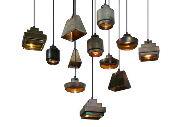
Matti Klenell
I found Klenell's blog when researching recent designers. I really love this chair, although I'm not keen on the colour. I think the shape and the idea of the chair is really interesting and it works really well, and i think it looks quite comfortable too, which is obviously and important factor.


Monday 1 October 2012
Photographers...
Irving Penn
I like how Penn's portrait work is done purely in black and white. I especially like this example of Penns work as i think it has a bit of a sinister aspect to it as you don't see the face of the subject, yet they are dressed smartly, suggesting the subject is important. This photograph reminds me strongly of an Artists work, Heiko Muller which is shown below.

(Penn's work)

(Heiko Muller's work)
I find this work really strange because it looks slightly like a painting rather than a photograph. I think this is due to the backgrounds used and the very soft colours used.

Sarah Moon
Moon uses produces soft images which are slightly out of focus. I like the image below because i think it looks very delicate, suggesting that the subject is delicate too.

Cindy Sherman
I've studied Sherman before and i find her work really interesting. She dresses up within her photography as stereotypes or anti-stereotypes. I like these because it challenges the norm or relates to it. The images below, for example, shows a well dressed woman sitting very 'unlady-like' and making actions with her hands with wouldn't be associated with the 'higher class'. I like the vivid tones in Sherman's work, as i think this makes the subject appear bold.

Gregory Crewdson
I love Crewdson's work. I love how vibrant the images are and how each one tells a story. I think its really clever how the composition and the lighting together make the images appear a bit sinister, especially this image with the woman stood in light whereas the rest of the frame is much darker.
Nan Goldin
Much of Goldin's work reminded me of the film 'Trainspotting', how the surroundings all seem a bit bleak and with the images relating to drugs/addiction, i think this adds to the meaning behind the images. Non of the subjects appear to look happy in the images and especially the image below the subjects are slightly out of focus and i see this as portraying the message that if in the situation that these people obviously are, everything is slightly out of focus to you.

Saturday 29 September 2012
Work in the style of Thorsten Brinkmann...
In pairs we took pictures in the style of Thorsten Brinkmann. Brinkmann dresses people with cloaks of materials and even covers the faces. He uses pose and props to tell the attitude of the subject without using facial expression or showing any skin. Below are two examples of Brinkmanns work.


These are our own photos in the style of Brinkmann. The first image is with me as the subject and the second is how i dressed my subject.

(Me as the subject)


(How i dressed my subject)
Friday 28 September 2012
Light Photos..
Our group was split into two separate groups, we then took it in turns for one group to pose while the others drew around them with torches. Because the shutter was left open on the camera it picked up any light shown over the period of time before the shutter closed. Because there was no other light in the room, it only shows the light from the torches. This gives a really nice effect and depending on the type of movement made with the torch changes the types of lines produced, for example on the image below some where draw around in a neat way where others were drawn around in a 'scribbly' way.


Thursday 27 September 2012
Photography...
Tuesday 25 September 2012
Week Three: Photography...
Annie Leibovitz
The work of Leibovitz that i looked at, was mainly her Disney dream portraits. Personally, i love them, however, i don't know whether this is because of my love for anything Disney. I like Leibovitz style, as all her work is very bright even if the colours aren't very vibrant and there is a lot of contrast, giving the photos a glow. However, on the websites that i looked at to view the work, people had argued that Leibovitz doesn't necessarily have skills as a photographer, rather more that she has a variety of skills on photoshop.


The work of Leibovitz that i looked at, was mainly her Disney dream portraits. Personally, i love them, however, i don't know whether this is because of my love for anything Disney. I like Leibovitz style, as all her work is very bright even if the colours aren't very vibrant and there is a lot of contrast, giving the photos a glow. However, on the websites that i looked at to view the work, people had argued that Leibovitz doesn't necessarily have skills as a photographer, rather more that she has a variety of skills on photoshop.

Eadweard Muybridge
I looked at Muybridges photography during my A Levels when doing a project on animals and movement. Muybridge was the first photographer to show movement within his work, he did this by documenting pictures of horses and figures moving and displaying them next to each other. Because of when these were produced, they look quite old fashioned in the sense that they arent detailed and are mainly just showing suilettes, however i think this suites the nature of the work. 
Sandy Skoglund
Skoglund uses ordanary settings for her images but makes it so there is a maxium of four colours in each image (well this applies to the images i have looked at). This makes the subjects that are bright colours stand out above everything else that is present in the shot. I really like these images, because i think they suggest how everything is mass produced, even life, and i think this image below, is trying to suggest that this couples life would be dull without the cats.
Subscribe to:
Posts (Atom)